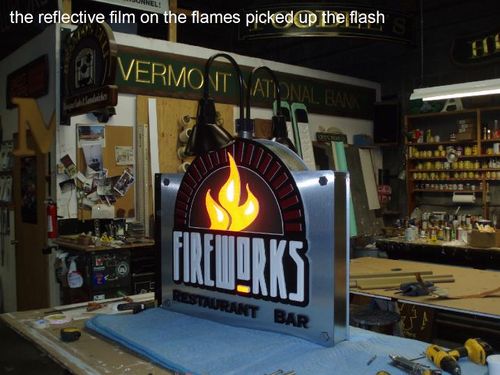
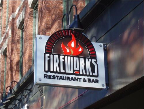
Projecting sign with an Industrial look


Mary and I love pizza. We make it all year long at home and enjoy sampling it where ever we go so when we heard one of our favorite pizza restaurants, Fireworks, (from Brattleboro VT) was going to open their second location in Keene we were excited. After a long phone call from Matt the owner I wanted a pie right then but instead lived with thoughts of pizza and what kind of sign we might dream up. Matt had seen another sign we made many years ago for Prime Roast Coffee Co. two doors down from his new spot and mentioned he would like something like it. The coffee sign was made of painted steel, and copper it was 10" thick and it had a sort of industrial look to it. They already had a logo which was white on red and had a simple hanging plywood sign at the original restaurant. When I sketched out my idea for the projecting sign I new it would be a great looking and effective sign and was really hoping Matt would go for it even though it was about 4 times what he was thinking for cost. Well on Monday he called and told me "I didn't think I needed this but after looking at the sketch all weekend now I have to have it. Yahoo! It was one of the best compliments I could get as a sign designer.
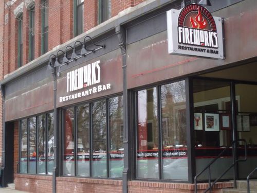
The front of the new location was another story. It had an old awning that came down to reveal, behind it, a copper clad wall with a nice but imperfect patina from where the awning frame touched the copper. It was big and empty and the floor inside was up a few steps so it looks really tall from the street. I took some photos of the bare store front and started playing with ideas to use the space well and not break the bank trying to cover the 45' area with signs. What I came up with was pretty straight forward cutout raise letters but to get them off the old copper we made a steel frame and mounted them so they float off the wall be about 5". It gives a really cool effect with the lights on. The red bands on either side were to stretch the design across more frontage and we may go back and make them a little bolder.
We finished fabricating everything and got it installed just before we moved out of our old shop. The finishing touch was the 4 color vinyl and etched glass job that Mary installed all along the windows, it really pulled together the store front look. We were invited to a pre-opening night and everyone one was thrilled with the way it came out.
I almost forgot, if you are ever in Keene stop by Fireworks at 22 Main Street and make sure to sample the brick over pizza.